AI Paint Colour Visualisers: What They Can Really Tell You
Paint is the cheapest way to change a room and the most annoying to get wrong, because getting it wrong costs a weekend rather than money. Everyone knows the story: the chip looked like a soft warm white in the shop, and the wall came out the colour of a hospital corridor.
So it is completely reasonable to want a preview. The catch is that the thing you are previewing is not really a colour. It is a colour plus the light in your room plus the sheen you chose plus everything else that light bounces off before it reaches the wall. A render collapses all of that into one flat answer, and it usually collapses it wrongly.
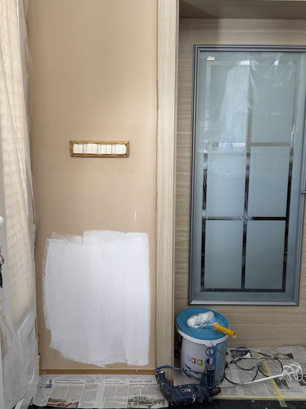
The unglamorous method that outperforms every visualiser. Note the honest problem with it too: judging white against a tan wall makes the white look colder than it will once the whole wall is done.
What a render cannot know about a colour
The light reflectance value. LRV runs from 0 for black to 100 for pure white and it is printed on the back of most paint chips. It is the closest thing to an objective number in this whole subject, and it drives the decision more than the hue does: a colour in the 70s bounces enough light to keep a dim room usable, one in the 20s will not, whatever it looks like in an image. No image model has this number, and none is calculating anything from it.
The undertone. Greys go blue, green or purple. Whites go yellow, pink or blue. Undertone is what makes two colours that look identical on a screen fight each other on adjacent walls, and it is the reason a "warm white" can turn creamy against a cool grey sofa. Renders average toward what looks pleasant in the picture, so undertone is exactly the thing they smooth away.
The sheen. Matt throws back around 2 to 5 percent of the light hitting it, eggshell 10 to 25, satin 25 to 35, and gloss more than 60. The same colour in matt and in satin reads as two different colours in the same room, and satin will show every flat patch of filler on a wall that matt would have hidden. Renders draw a uniform matte surface, always, and quietly delete the entire finish decision.
The second coat and the drying. One coat of a strong colour over a pale wall is not that colour, it is a wash of it, and a dark shade over light frequently needs three. Nothing in a render corresponds to coverage, and a litre of emulsion covers roughly 10 to 12 square metres per coat, which is the other number the picture will not give you.
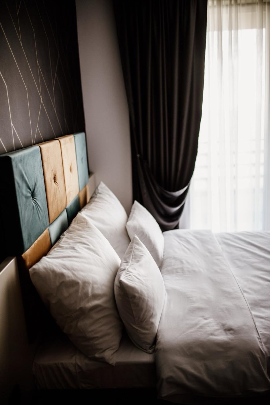
Every room has a bright end and a dark end. The same paint reads as two colours across that distance, and a single render simply averages the difference away.
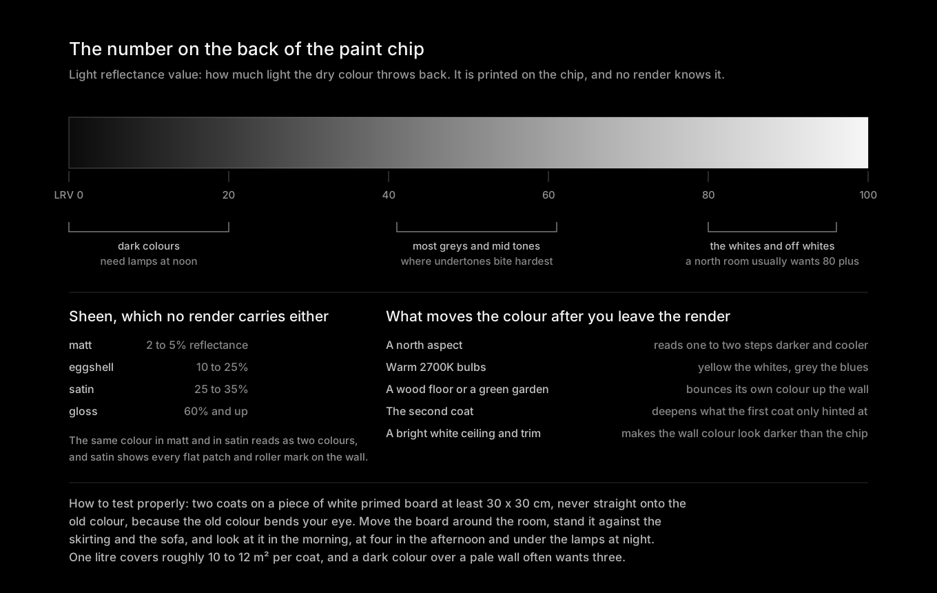
The numbers that actually decide the outcome. A render carries none of them, which is why the same colour keeps surprising people.
The screen problem, which is worse than people think
There is a physical mismatch underneath all of this, and it is worth understanding once because it explains most of the disappointment.
Your screen emits light. A wall reflects it. A phone at full brightness in a dim room is throwing out light a matt wall painted the same nominal colour could never produce, because the wall can only give back a fraction of what falls on it. That is why deep colours look rich and luminous in a render and heavy in a hallway, and why pale colours look crisp on screen and slightly grubby in a north-facing room.
On top of that, the model shifts the white balance of the whole image when it repaints a wall. Look at your floor and your sofa in the render. If they changed colour too, then the comparison you are making is not between two paint colours, it is between two versions of the entire photograph. This is the same underlying failure we describe in why AI renders your room brighter than it really is, and it hits paint harder than anything else because paint is nothing but colour.
The video above covers the part no visualiser will ever do for you: seeing the undertone by comparison rather than in isolation. That instinct, always judging a colour next to another one rather than on its own, is the single most useful habit in this whole subject.
What AI is genuinely good for here
Killing options fast. If you have thirty colours saved, the render will get you to five in an evening, and it will do it in your room rather than in a photograph of somebody else's. That is real value, and it is most of the value.
The all-four-walls versus feature-wall question. This is pure proportion and renders handle proportion reasonably. Seeing your own room with one dark wall and then with four is genuinely informative even if neither image is colour-accurate.
Whether the trim should stay white. Painting the woodwork the same colour as the wall, or leaving it bright white, changes a room more than the wall colour itself. It is a big, obvious, visible change, so it survives the render's inaccuracy.
Ceilings. A colour on the ceiling drops the apparent height of a room, and people find that very hard to imagine and very easy to see in a picture.
Pairing with the things you already own. A restyle keeps your sofa, your floor and your curtains in frame, so you can see whether a colour argues with them. If curtains are also on your list, the same logic applies in AI interior design for curtains, where colour is the part AI is best at.
The specific failure modes
Colour that changes between generations. Ask for the same colour twice and you get two colours. There is no colour database behind the model, so a named shade from a specific brand is a vibe rather than a value, and asking for it by product name gives you the mood of the marketing photo, not the pigment.
Cast bleeding over everything. Repaint a wall green in a render and the model often greens the ceiling, the sofa and the floorboards a little too. Sampling a hex value out of that render tells you nothing about the paint.
Edges and cutting in. Renders draw perfect junctions where wall meets ceiling and skirting. Real walls have a hand-cut line, and a strong colour makes every wobble in that line visible from the sofa. It is not a reason to avoid the colour, but it is a reason to budget for a decent painter.
Texture erased. Woodchip, lining paper, old plaster, a repaired patch: all of it is smoothed out. A dark satin over an uneven wall is the most unforgiving combination in decorating and the render will show it as glass.
Dark rooms getting sunshine. The strongest single tell. If the render's light is coming from a direction your window is not, the colour in it is fiction. Dark aspects have their own guide in AI interior design for north-facing rooms.
A paint render tells you which five colours to test. The test tells you which one to buy. Skipping the second step is how rooms end up hospital-white.
How to test properly, in about a day
Buy sample pots for the shortlist and paint two coats onto white primed board or lining paper, at least 30 x 30 cm, and larger if you can. Never paint the sample directly onto the existing wall colour, because the old colour distorts your reading of the new one, which is exactly the problem visible in the photograph at the top of this page.
Then move the boards. Stand them against the wall by the window, then on the darkest wall, then next to the sofa and the floor and the trim. Look at them in the morning, again at four in the afternoon, and once more under your own lamps at night, because a warm 2700K bulb will yellow a white and grey out a blue. If your room faces north, or a large tree or a red brick wall sits outside the window, that bounce is now part of your colour whether you like it or not.
Give it a full day and a night. It is boring, it is not shareable, and it is the only method that has ever worked.
Questions people ask about AI paint visualisers
Will the paint look like the AI render?
Not exactly, and usually a bit duller and heavier. The render bakes light into the colour and shows it on an emissive screen, while your wall only reflects whatever light your windows and lamps deliver. Expect the real thing to be less luminous, particularly in a dark room. The longer answer is in will a paint colour look like it does in the AI render.
Can I give the AI a specific brand colour name?
You can, and it will produce something in the right neighbourhood, because those names appear in its training data attached to styled photographs. It is not colour matching, it is association, and the value it returns is the mood of that brand's photography rather than the paint itself. Get the LRV from the chip and use that to reason about how the colour will behave.
Is a photo-based restyle better than a generated room?
For paint, much better. A restyle keeps your window position, your floor and your furniture, so at least the relationships in the image are yours. A generated room is a picture of a different house, and any colour judgement made from it is a judgement about someone else's light.
Can AI tell me how much paint to buy?
No, but the arithmetic is easy enough to do yourself. Measure the wall area, subtract the doors and windows, and reckon on 10 to 12 square metres per litre per coat. Then double it for two coats, and add a third coat if you are putting a strong colour over a pale wall.
The honest position: paint is the decision where AI is most seductive and least reliable, because the output looks exactly like the thing you are trying to predict and is made of something else entirely. Use it to cut thirty options down to five, which is the tedious part. Then paint a board, walk it round the room, and let your own light make the final call. And if the walls are getting repainted anyway, this is the moment to sort out where the pictures go, because filling old holes is a lot easier before the new colour goes on.
Image credits: "Room in renovation with partially painted wall and painting supplies" and "Cozy modern bedroom with plush pillows and elegant drapes in bright daylight" by Shixart1985, licensed CC BY 2.0, via Wikimedia Commons. Diagram by MeltFlex Solutions.